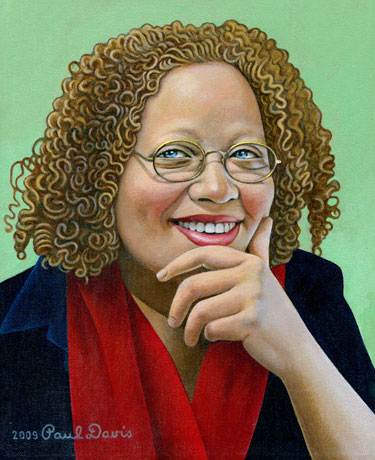
Gail Anderson embodies three virtues: inspiring art director, inspired designer, and inspiirational teacher. Despit being deceptively low key, she does everything with intesnse passion. Her extreme devotion to craft (she often frets for ages over theminutest typographic detail) combined with an unceasing, though always natural, pursuit of whimsy distinguishes her brand of quirkiness from the larger pack of knee-jerk quirks. While some might choose to call her method retro, the work defies stylistic pigeonholing. She revels in making typography from old and new forms, which is neither modernist nor post-modernist, but rather spot-on contemporaneous.
Working with Fred Woodward at Rolling Stone was a hand-in-glove experience. They knew each other about as well as two people could. “Music always set the tone and he was into low lighting, so the design room felt sort of cozy,” Anderson recalls. “And he’d just howl with glee when we ‘got it’ and it was a winner. He could really get you jazzed about the process, even when it was difficult.” Anderson’s own typographic proclivities were ultimately well suited to Rolling Stone, where she designed what might best be called “theatrical typography.”
Anderson has a special gift for assigning illustration and has been a stalwart advocate of illustrators. “With her keen eye for fresh talent, she nurtured a whole generation of illustrators,” says Woodward, “while staying loyal to the greats as well.”
The most difficult time in her career came in 2002, after her move to Spot Co., when negotiating the transition form editorial design to advertising. “You approach each project searching for a dozen great ides, not just one or two,” Anderson explains of how her work competes for the attention (and dollars) of theatergoers.
Typographically, Anderson is always looking for that little visual wink or tiny gesture of extra care. “I’m all about the wood type bits and pieces. I love making those crunchy little objects into other things, like faces,” she says. A fancy border and detailed extras are always part of her repertoire. “I’d ask the designers I work with to put them on everything, if I could,” Anderson says. “Of course, it’s not always appropriate and sometimes the more straightforward approach is more confident or what’s called for. But any little bit of extra attention is always welcomed, and I just hope that the client won’t ask for it to be removed.”
More often than not, however, Anderson admits that even in her theater posters the ornamentation is peeled off little by little. “I guess there’s concern that consumers will get mesmerized or confused by the detailing and forget to buy tickets. But if we’ve done our job properly, the doo’dads become part of the package, and not something getting in the way that needs to be reduced or cut out.”
For its human dimension, the art for The Good Body, a play about women and body image by The Vagina Monologues author, Eve Ensler, struck just the right chord with its Isabelle Dervaux line drawing and the ice cream scoop breasts. But Anderson may be best known for the Avenue Q subway/puppet fur logo, a delightfully witty image that became an indelible brand for the play. “I’m definitely wittier on paper than in real life,” she laments, “I think I approach the work looking for a little wink where I can, because deep down, I hope people associate clever with smart. Or maybe in the end, if I think of it as disposable, I’m less likely to fear experimenting a little.”
For much of her career Anderson has been the quintessential collaborator because, as she notes, “it’s more fun to work with other designers and art directors; I really enjoy the back and forty.” These days, though, she likes designing alone, “in my office, with my music on.” She adds, “Most high-octane, solo designing has to be done at night. I’m trying to change my ways before I look up and I’m 50.” Heaven forbid.
Steven Heller
Co-chair MFA Designer as Author, School of Visual Arts
Portrait by Paul Davis
